Framing and Composition
The purpose of a contact sheet is to be able to quickly scan a series of images to find the keepers or the ones chosen to be enlarged. I took a lot pictures from all the 8 framing techniques and then I choose the best 18 photos and I put them in a collection. I started editing all those pictures and I gave them a caption. I also sorted them. After I did that I started creating the Contact sheet and named it.

I choose this picture for my best "bird eye view", because I think you can really see how a bird from above the ground would see this. I learned that there is an angle how to take a "birds eye view" photo.
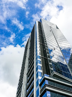
This is my best version of "bugs eye view", because I felt like a bug from the ground looking up to the building when I took the picture. I learned that I have go on the ground to take a "bugs eye view" picture.
I took this photo as my best "close up" because I really had to get close to the eye to take the picture, it was uncomfortable close. I learned that I have to get really really close to my subject to take a good "close up" photo.
This is my best "diagonals" picture. I choose this because I think you can see the diagonals very good and when you look closer to the picture you can even see two diagonals, one vertical and one horizontal.
I choose this as my best "filling the frame" picture, because it really uses all the space of the photo and there is no free space. I learned that "filling the frame" could also look very cool, because I normally do not like that.
This is my best "frame within a frame", because you can really good see ll the other frames and I also like the green color of the frames a lot. This project was the first time I paid attention to see a frame in a frame and I think I can use this method in many photographs in the future. It makes the picture special and interesting.
I took this as my best "leading lines" picture because you can really see how the line leads and it looks like the line never ends.
I choose this picture as my best from "rule of 3rds". I think you can really good see who the photo is divided by 3, into 3 parts. I learned that it looks better when it is divided by 3 instead of 2.


